Application Widgets
Elements Object
This object is used to display an indicator with different labels, icons and values.
You can create your own indicator inheriting from StartsElement or BoxTileElement class, then you must implement all methods.
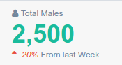
class MemberStats(StatsElement):
    def get_top_icon(self):
        return "fa fa-user"
    def get_top_text(self):
        return " Total Males"
    def get_count(self):
        return "2,500"

    def get_count_color(self):
        return 'green'

    def get_bottom_color(self):
        return "red"

    def get_bottom_text(self):
        return "From last Week"

    def get_bottom_icon(self):
        return "fa fa-sort-asc"

    def get_bottom_icon_text(self):
        return "20%"
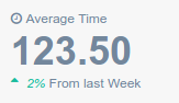
class ClockTime(StatsElement):

    def get_top_icon(self):
        return "fa fa-clock-o"

    def get_top_text(self):
        return "Average Time"

    def get_count(self):
        return "123.50"

    def get_bottom_icon_text(self):
        return "2%"

    def get_bottom_color(self):
        return "green"

    def get_bottom_text(self):
        return "From last Week"

    def get_bottom_icon(self):
        return "fa fa-sort-asc"
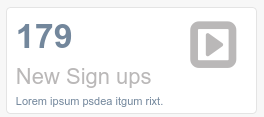
class SignupsBox(BoxTileElement):
    def get_icon(self):
        return "fa fa-caret-square-o-right"
    def get_number(self):
        return "179"
    def get_title(self):
        return "New Sign ups"
    def get_subtitle(self):
        return "Lorem ipsum psdea itgum rixt."
Exist a StatsCountList class used to display StartsElement in a row, and many elements as we want
class StatsCountListExample(StatsCountList):
    stats_views = [ClockTime, MemberStats, ClockTime, ClockTime]

Exist a BoxStatsCountList class for the same purpose but to display BoxTileElement
class BoxTileElementExample(BoxStatsCountList):
    stats_views = [SignupsBox, SignupsBox, SignupsBox,SignupsBox ]

Chart Widget
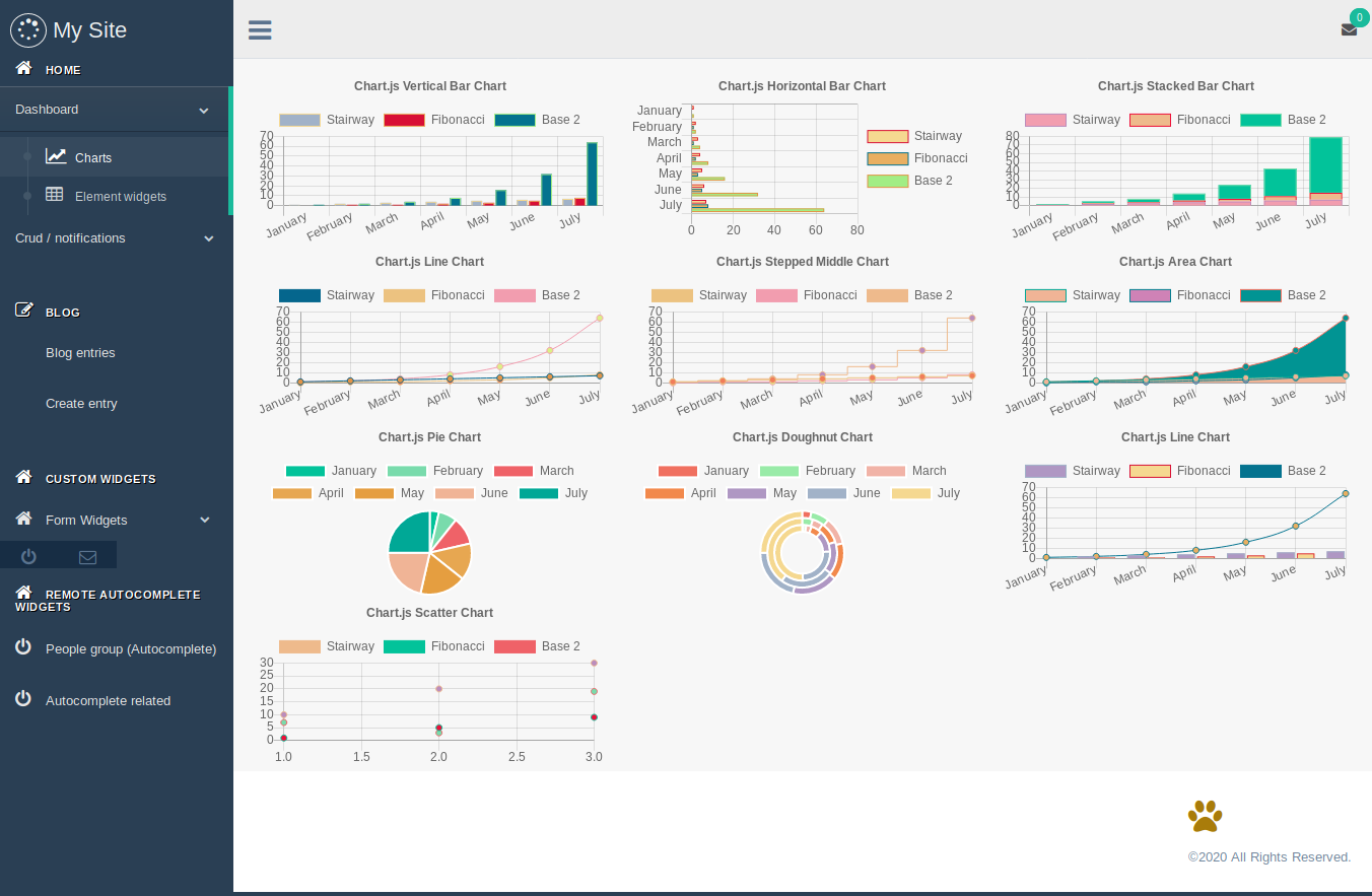
You can register automatically chart widgets api creating a gtcharts.py in your app, djgentelella look for charts view for all apps in INSTALLED_APP.
This app use Chartjs for build chart, you need to provide the right structure in the dataset, for examples see here
from djgentelella.groute import register_lookups

@register_lookups(prefix="verticalbar", basename="verticalbar")
class VerticalBarChartExample(BaseChart, VerticalBarChart):

       def get_labels(self):
            return [...]
       def get_def get_datasets(self):
            return ...
       def get_title(self):
            return {'display': True,
                    'text': 'Chart.js Example'
                    }
You can use @register_lookups in any part of your code, but remember to import it on url.py, and set your app before ‘djgentelella’. Also prefix and basename needs to be unique.
To show in templates you can use this snippet:
<div class="row">
    <div class="col-md-4">
    {% include 'gentelella/widgets/chartjs.html' with graph_url=context_url_variable %}
    </div>
</div>
To build url you can use
from django.urls import reverse
context_url_variable = reverse(verticalbar-list)
Note
To build the url you need to append list to basename like <basename>-list
Available Charts
VerticalBarChart
HorizontalBarChart
StackedBarChart
LineChart
PieChart
DoughnutChart
ScatterChart
Note
Pie and Doughnut have different way to build datasets, see chartjs documentation for more.
Chart Options
You can build your own options overwritting this methods.
get_responsive
get_maintainAspectRatio
get_indexAxis
get_legend
get_title
get_tooltips
get_hover
get_scales
get_elements
get_animation
get_plugins
Each one returns the value of the option it names, and get_options puts it
where Chart.js expects it. get_title, get_legend and get_tooltips
end up under options.plugins (as title, legend and tooltip),
which is where Chart.js 3 moved them; get_plugins is for any other plugin,
including third party ones, and is merged with the three above.
Scales are a dict keyed by axis name, not the two lists of Chart.js 2:
def get_scales(self):
    return {'x': {'stacked': True},
            'y': {'stacked': True,
                  'title': {'display': True, 'text': 'units'}}}
Chart.js 4 vocabulary
This library moved from Chart.js 2 to Chart.js 4, which renamed a good part of the configuration. If you are porting charts written for the old release:
The getter names did not change, and the last five rows are translated for you:
a get_scales still returning xAxes/yAxes, an elements.rectangle
block, a steppedLine dataset key and a get_type returning
horizontalBar all keep working. Treat that as a grace period, not as the
supported vocabulary.
Tooltip callbacks
A callback cannot travel as JSON, so the server sends its name and the browser
looks it up in document.chartcallbacks:
document.chartcallbacks.mylabel = function (context) {
    return context.dataset.label + ': ' + context.parsed;
}
def get_tooltips(self):
    return {'callbacks': {'label': 'mylabel'}}
label, beforeLabel, afterLabel, title and footer are looked
up this way. Chart.js 3 replaced the old (item, data) arguments with a
single tooltip context object, so a callback written for Chart.js 2 has to be
updated.
Pallete widget
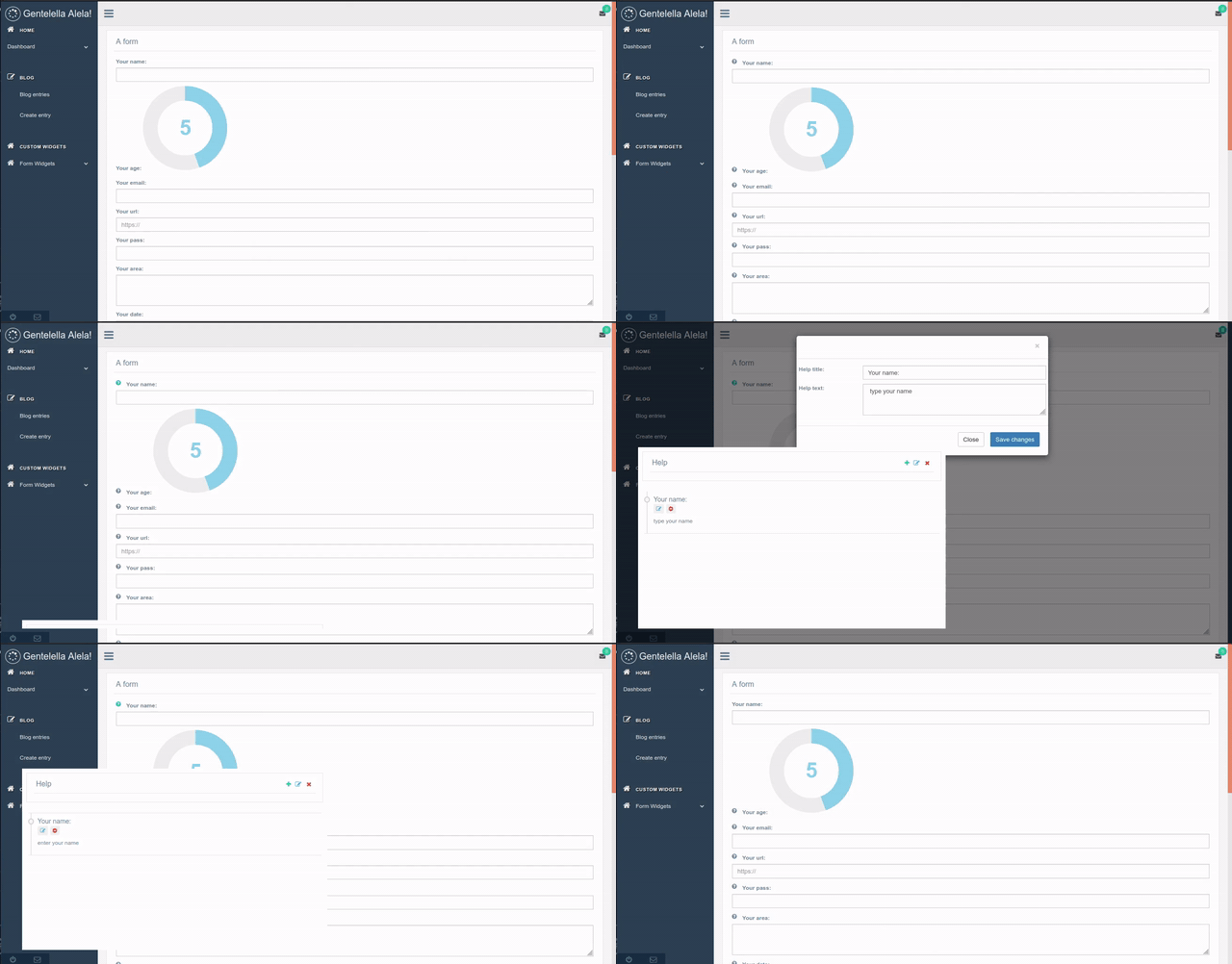
It is a kind of helper, that is located at the bottom left-hand side corner, with a mail icon. This widget is used to add a description for each input field in the different displayed forms of the views. When we hit the mail icon the helper modal is displayed.
The help button appears at the left side of the label for each input field as a question mark, when we hit the show button in the helper modal.
We can see, add, modify, and delete descriptions for each field.
How to add this widget ??
You must create MenuItem as follow:
Note: the only place in which this widget can be place is in the sidebar footer.
item = MenuItem.objects.create(
    parent = None,
    title = '',
    url_name ='djgentelella.menu_widgets.palette.PalleteWidget', #path to the widget file
    category = 'sidebarfooter', # the only place in which this widget can be place
    is_reversed = False,
    reversed_kwargs = None,
    reversed_args = None,
    is_widget = True, # must be set to true as exist other kind of element
    icon = 'fa fa-envelope-o', # you can use fontawesome icons
    only_icon = True # this flag must be True
)
Notifications app
How to install it ??
After add ‘djgentelella’ to INSTALLED_APPS variable in the settings file, you will be able to use this app.
Then to use notification you must use create_notification function.
from djgentelella.notification import create_notification
Create a notification for provided user, and send email notification if it’s set
There is two default setting you can configurate on django settings
NOTIFICATION_DEFAULT_SUBJECT
NOTIFICATION_DEFAULT_TEMPLATE
All settings have a default value provided by django-gentelella-widgets, but you can overwrite it.
- param description:
description to show
- param user:
user to be notified
- param message_type:
type of message available options (info, default, success, warning, danger) there is no priority here yet
- param category:
used for group notifications (not required)
- param link:
complete url or reverse name (see django reverse)
- param link_prop:
when is set, the link is take as reverse name, you need to provide dict of args and kwargs
- param request:
it’s django request used on email and for make a complete uri on reverse
- param send_email:
True/False specify you want to send a email notification
- param email_subject:
alternative subject message
- param email_template:
alternative email template
- param email_context:
extra context for email template
- return:
notification object
You can also add a widget to handle notifications from navbar.
- class djgentelella.notification.widgets.NotificationMenu(context)
This widget help to create a notification on menú, was tested only on top nav
MenuItem.objects.create(
    parent = None,
    title = 'top_navigation',
    url_name ='djgentelella.notification.widgets.NotificationMenu',
    category = 'main',
    is_reversed = False,
    reversed_kwargs = None,
    reversed_args = reverse('notifications'),
    is_widget = True,
    icon = 'fa fa-envelope',
    only_icon = False
)
The follow arguments has a special behaivior
reversed_args: allow you to set custom URL for notification management API
reversed_kwargs: allow you to set custom URL for notification list
You can set both as None to use default values.
PositionsGrid
A matrix of rows and cells where each cell holds zero or more opaque items.
The widget knows nothing about what an item is: the host decides how it looks
with renderItem and what each gesture does with handlers.
const grid = new PositionsGrid('warehouseGrid', {
    editable: true,
    renderItem: (item) => `<div class="card card-body p-2">${item.code}</div>`,
    handlers: {
        addRow:     ()         => post('add_row'),
        removeRow:  (i)        => post('remove_row', {row: i}),
        addCol:     ()         => post('add_col'),
        removeCol:  (i)        => post('remove_col', {col: i}),
        createItem: (r, c)     => post('create_item', {row: r, col: c}),
        moveItem:   (id, r, c) => post('move_item', {id: id, row: r, col: c}),
        removeItem: (id)       => post('remove_item', {id: id})
    }
});
This is the part that matters. The widget keeps no state of its own. data
and items are always the last payload a handler resolved with. Every
mutation goes out through a handler that returns Promise<{data, items}>, and
the only thing the widget does with the answer is repaint.
A rejected promise repaints nothing and fires pg:error. The screen keeps
showing exactly what the server last confirmed, so a failed request cannot leave
the grid displaying something the server never agreed to. Nothing is applied
optimistically, and there is no Save button because there is no intermediate
state to lose.
Only one mutation is in flight at a time; a second call while the first is
pending fires pg:error with code: 'busy' and does nothing.
Rows may have different lengths, and that is the point: the shape is the host’s
data, not a grid the widget imposes. A warehouse of [2, 4, 3, 4] renders as
row 1  | A | B |
row 2  | A | B | C | D |
row 3  | A | B | C |
row 4  | A | B | C | D |
Every cell is the same width and the rows are left aligned, so a two-cell row
occupies exactly half the width of a four-cell one. Nothing is padded out to a
rectangle. Internally each row is its own CSS grid and they all share one track
template driven by --pg-cols (the longest row), which is what keeps the
columns lined up without inventing filler cells.
|
|
|
|
|
|
|
|
|
shows the editing controls (default |
|
narrowest a cell gets before sideways scroll |
|
|
|
the seven functions below |
|
overrides for the accessible names |
Every handler resolves with the whole new state, so from the widget’s point of view they are interchangeable. A missing handler means the control does not exist: that is how partial permissions compose without a flag per action.
|
a new row |
|
reject when the row still holds items |
|
one cell to every row, so irregularity stays |
|
only the rows that have that column shrink |
|
the host opens its own form |
|
always by id, never by DOM coordinates |
|
setData(data, items), setEditable(editable), highlight(id),
scrollToItem(id), select(id), clearSelection(), destroy(), plus
the seven mutators, which are the public form of the handlers.
All bubble, none are cancelable — cancelling would mean local state divergence, which is the thing this widget refuses to have.
|
|
|
|
|
|
|
|
|
|
|
|
Moving an item is two taps: tap the item to pick it, tap a cell to place it. No drag API is involved, so it works identically on a phone and from the keyboard; the desktop drag reuses the same code path and is only enabled where there is a fine pointer.
Arrow keys move between cells with a roving tabindex, and the clamp respects
the irregularity: going down from column 3 into a two-cell row lands on that
row’s last cell rather than nowhere. Enter picks and places, Escape
cancels, Delete removes when editing.
Note
base.js is generated. After changing the widget run
python manage.py createbasejs.
The demo at /positionsgrid_view wires all seven handlers to real endpoints
and refuses to delete a row that still holds boxes, which is the only way to see
the rejection path on screen.